Our Colors
Our Voice & Tone
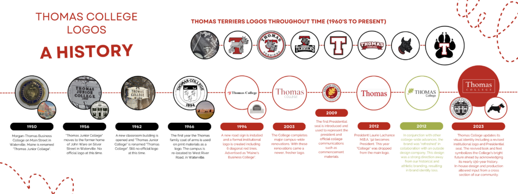
Our Logos
Thomas College Logo
The Thomas College logo is essential to our brand. It acts as the primary graphic identifier for Thomas and is the preferred logo for general use. The logo should always be a consistent component in our communications.
![]()
Usage
Primary Logo (as shown above) – Intended for use on white copy on darker backgrounds in order to maintain legibility.
We also have a White Logo available.
Requirements
The Thomas College logo should never be recreated or typeset. Only the official logo files should be used in communications.
Department Logos
Each department has a logo that follows the same style.
NOTE: CLICK on the image to get the larger version or right-click and "Save Image As..." If you right-click and "Save Image as..." on the logos below, you'll get the smaller image.

Our Typography & Resources
Typography
Inspired by and used in tandem with our voice and tone, our typography serves as a further extension of our brand.
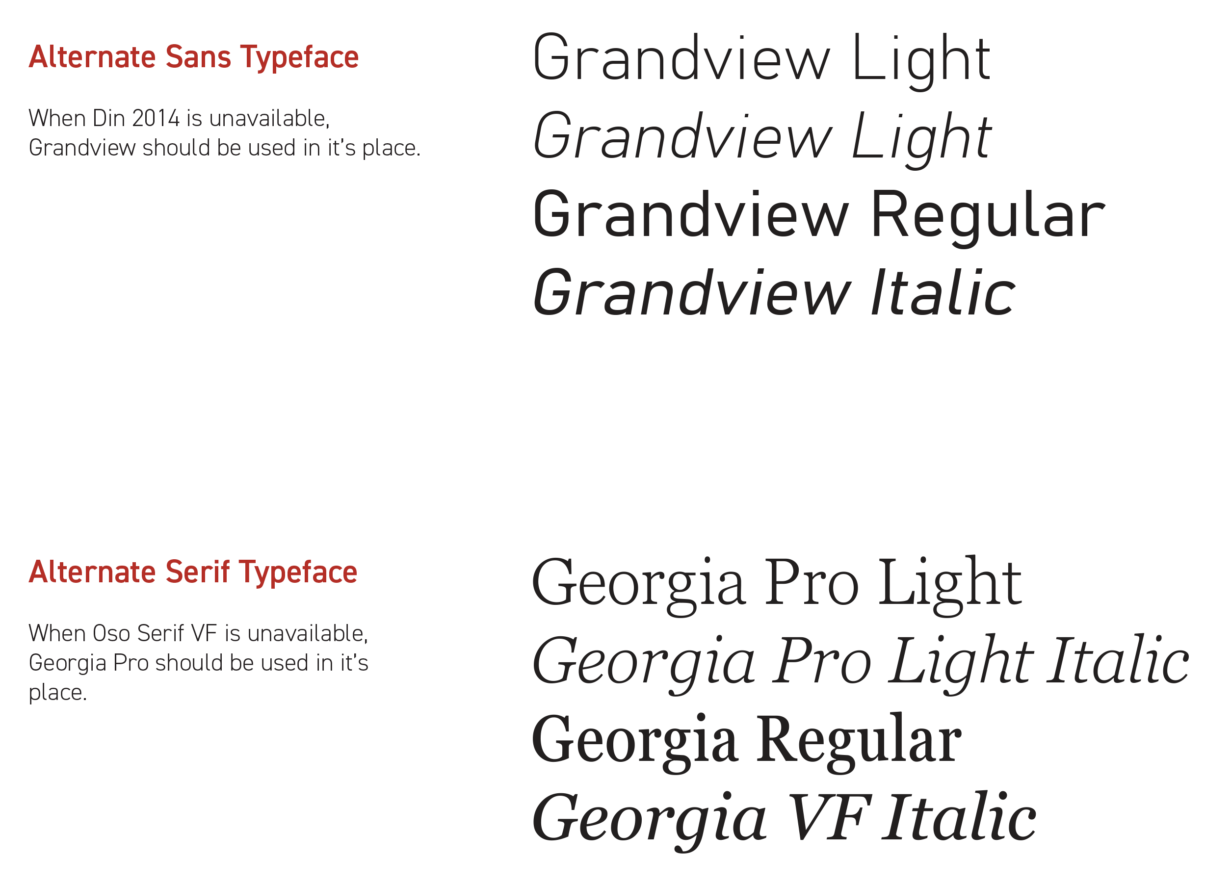 |
The fonts on the left are included by default in Office 365 software, eliminating the need for additional downloads and installations. Please refer to page 13 of the VIT for additional information. Resources |
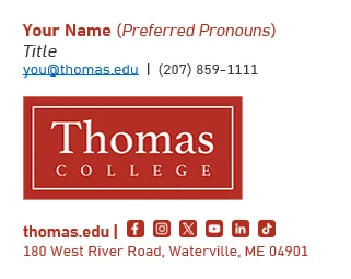
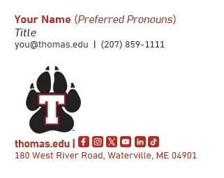
Email Signatures
- Download Email Signature Word Document for Templates (Word Doc)
- Instructions available for:
Thomas College Signature Example |
 |
Athletics Signature Example |
 |
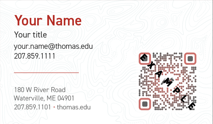
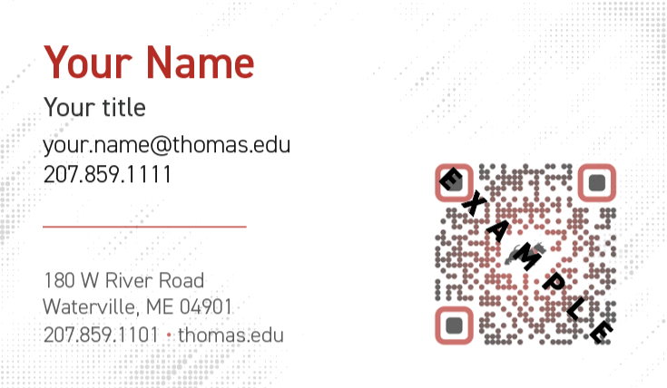
Request Business Cards

Request a Name Tag
Microsoft Teams Backgrounds